ADA Sign Standards

The Americans with Disabilities Act (ADA) has standards for signs to ensure that persons with disabilities, particularly those with visual impairments, can easily navigate and access information in public spaces by providing clear, legible signage with features like raised lettering, braille, and high contrast colors, allowing them to independently identify rooms, exits, and other important locations. ADA Standards for Accessible Design (2010) lists the signage rules and requirements.

ADA Compliant Font Guidelines

Below are several ADA compliant font rules, ensuring accessibility for blind or visually impaired persons (US Access Board).

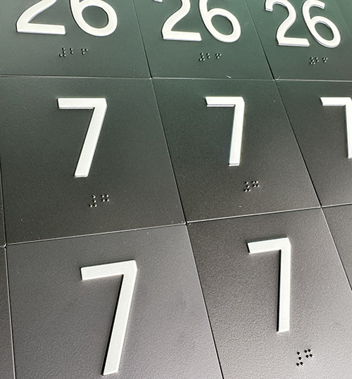
  • Depth (703.2.1).  Raised characters (tactile) must be raised a minimum of 1/32”.
  • Case (703.2.2).  Characters must be uppercase (lowercase should be avoided).
  • Style (703.2.3).  Only Sans Serif characters, not in italics nor script.  ADA compliant fonts include Arial, Helvetica, Verdana and Tahoma.  TRADA SIGNS defaults to SansSerif (if not specified).
  • Proportions (703.2.4).  Characters with fonts where the width of the uppercase “O” is 55 percent minimum and 110 percent maximum of the height of the uppercase “I”.  
  • Height (703.2.5).  Measured 5/8” to 2” based on the uppercase “I”.  
  • Stroke Thickness (703.2.6).  Stroke thickness of the uppercase “I” shall be 15 percent maximum of the character height.
  • Character Spacing (703.2.7).  Minimum 1/8” of space between adjoining characters.
  • Line Spacing (703.2.8).  Spacing between baselines of separate lines of raised characters in a message 135 percent minimum and 170 percent maximum of the raised character height.
restroom sign

Additional ADA Compliant Sign Guidelines

  • Contrast Ratio.  ADA signs must have a high contrast ratio (strongly contrasting colors between the content and the background) as well as a non-glare finish.  TRADA SIGNS defaults to a 65 LRV (light reflectance value) or higher between the background and content.
  • Braille.  Signs that mark or identify a public area or space should be created in Grade 2 Braille, which enables a person with a visual disability to read it as fully integrated words. Braille spacing and sizing standards are more stringent in some states (California has the strictest guidelines).  TRADA SIGNS defaults to Grade 2 Braille (California compliant).
  • Pictogram.  Pictograms are recommended on signs that identify permanent rooms and spaces (if used, pictograms must be accompanied by descriptors in tactile and braille below the pictogram field).  Pictograms are commonly seen on restroom signs, though may not be required.  Pictograms must have a minimum 6” field height.
  • Installation/Mounting.  The tactile characters on a sign must be at a height of 48” to 60” from the ground (measured from the base of the characters).  See our Installation Guide for additional information.
Additional ADA Compliant Sign Rules

Consequences of Non-Compliant ADA Signs

Non-compliance can result in businesses alienating individuals with disabilities and creating a challenging environment for customers. 

Incorrect or missing ADA compliant signs can possibly lead to an expensive ADA related lawsuit or fines. The majority of ADA sign violations occur either from a lack of awareness of the regulations or in an attempt to bypass the rules to enhance the building’s aesthetics.

Partner with TRADA SIGNS as your trusted ADA sign supplier for all of your compliant interior code signage.